NGX Charts Grouped Horizontal Bar Chart
- With Code Example
- March 2, 2024

Series - NGX Charts
Before diving into using NGX bar charts, it’s essential to ensure that NGX Charts are installed and integrated with Angular. I’ve previously covered the detailed process of getting started with NGX Charts in another article. I highly recommend referring to that resource before proceeding with NGX bar charts implementation. It will provide valuable insights into setting up and leveraging NGX Charts within Angular applications, laying a solid foundation for incorporating specific chart types like NGX bar charts.
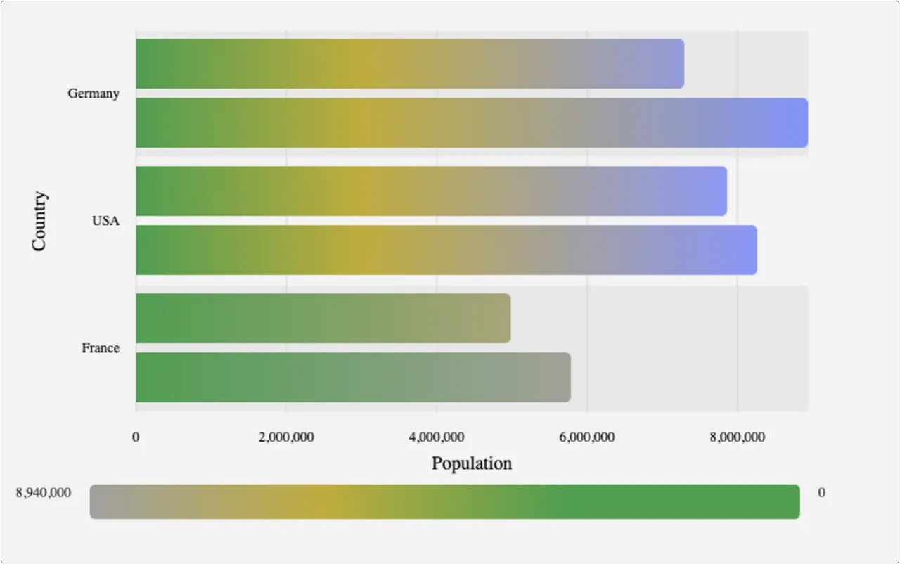
Grouped Horizontal Bar Chart
Example
- app.module.ts
- app.component.ts
- app.component.html
- data.ts
import { NgModule } from '@angular/core';
import { BrowserModule } from '@angular/platform-browser';
import { FormsModule } from '@angular/forms';
import { BrowserAnimationsModule } from '@angular/platform-browser/animations';
import { NgxChartsModule } from '@swimlane/ngx-charts';

import { AppComponent } from './app.component';

@NgModule({
  imports:      [
    BrowserModule,
    FormsModule,
    NgxChartsModule,
    BrowserAnimationsModule
],
  declarations: [ AppComponent ],
  bootstrap:    [ AppComponent ]
})
export class AppModule { }
import { Component, NgModule } from '@angular/core';
import { BrowserModule } from '@angular/platform-browser';
import { NgxChartsModule } from '@swimlane/ngx-charts';
import { multi } from './data';

@Component({
  selector: 'my-app',
  templateUrl: './app.component.html',
  styleUrls: ['./app.component.css']
})
export class AppComponent {
  multi: any[];
  view: any[] = [700, 400];

  // options
  showXAxis: boolean = true;
  showYAxis: boolean = true;
  gradient: boolean = false;
  showLegend: boolean = true;
  legendPosition: string = 'below';
  showXAxisLabel: boolean = true;
  yAxisLabel: string = 'Country';
  showYAxisLabel: boolean = true;
  xAxisLabel = 'Population';

  colorScheme = {
    domain: ['#5AA454', '#C7B42C', '#AAAAAA']
  };
  schemeType: string = 'linear';

  constructor() {
    Object.assign(this, { multi });
  }

  onSelect(data): void {
    console.log('Item clicked', JSON.parse(JSON.stringify(data)));
  }

  onActivate(data): void {
    console.log('Activate', JSON.parse(JSON.stringify(data)));
  }

  onDeactivate(data): void {
    console.log('Deactivate', JSON.parse(JSON.stringify(data)));
  }
}
<ngx-charts-bar-horizontal-2d
  [view]="view"
  [scheme]="colorScheme"
  [schemeType]="schemeType"
  [results]="multi"
  [gradient]="gradient"
  [xAxis]="showXAxis"
  [yAxis]="showYAxis"
  [legend]="showLegend"
  [legendPosition]="legendPosition"
  [showXAxisLabel]="showXAxisLabel"
  [showYAxisLabel]="showYAxisLabel"
  [xAxisLabel]="xAxisLabel"
  [yAxisLabel]="yAxisLabel"
  (select)="onSelect($event)"
  (activate)="onActivate($event)"
  (deactivate)="onDeactivate($event)"
  >
</ngx-charts-bar-horizontal-2d>
export var multi = [
  {
    "name": "Germany",
    "series": [
      {
        "name": "2010",
        "value": 7300000
      },
      {
        "name": "2011",
        "value": 8940000
      }
    ]
  },

  {
    "name": "USA",
    "series": [
      {
        "name": "2010",
        "value": 7870000
      },
      {
        "name": "2011",
        "value": 8270000
      }
    ]
  },

  {
    "name": "France",
    "series": [
      {
        "name": "2010",
        "value": 5000002
      },
      {
        "name": "2011",
        "value": 5800000
      }
    ]
  }
];
Input
| Property | Type | Default Value | Description |
|---|---|---|---|
| view | number[] | | Specifies the dimensions of the chart [width, height]. If left undefined, the chart will automatically adjust to fit the size of its parent container. |
| results | object[] | | Defines the data to be visualized in the chart. |
| scheme | object | | Sets the color scheme used in the chart. |
| schemeType | string | ‘ordinal’ | Specifies the type of color scale used. It can be either ‘ordinal’ or ’linear’. |
| customColors | function or object | | Allows customization of colors for specific data values in the chart. |
| animations | boolean | true | Enables or disables animations for chart transitions and updates. |
| legend | boolean | false | Determines whether the legend should be displayed alongside the chart. |
| legendTitle | string | ‘Legend’ | Sets the title of the legend. |
| legendPosition | string | ‘right’ | Specifies the position of the legend relative to the chart. It can be ‘right’ or ‘below’. |
| xAxis | boolean | false | Determines whether the x-axis should be displayed. |
| yAxis | boolean | false | Determines whether the y-axis should be displayed. |
| showGridLines | boolean | true | Controls the visibility of grid lines in the chart. |
| roundDomains | boolean | false | Specifies whether domains should be rounded for aligned gridlines. |
| showXAxisLabel | boolean | false | Determines whether the label for the x-axis should be displayed. |
| showYAxisLabel | boolean | false | Determines whether the label for the y-axis should be displayed. |
| xAxisLabel | string | | Sets the text for the x-axis label. |
| yAxisLabel | string | | Sets the text for the y-axis label. |
| showDataLabel | boolean | false | Determines whether the value number should be displayed next to the bar in the chart. |
| gradient | boolean | false | Controls whether elements in the chart should be filled with a gradient instead of a solid color. |
| noBarWhenZero | boolean | true | Specifies whether bars should be hidden when their value is zero. |
| trimXAxisTicks | boolean | true | Determines whether ticks on the x-axis should be trimmed to fit within the chart area. |
| trimYAxisTicks | boolean | true | Determines whether ticks on the y-axis should be trimmed to fit within the chart area. |
| maxXAxisTickLength | number | 16 | Sets the maximum length of ticks on the x-axis. Ticks exceeding this length will be trimmed if trimXAxisTicks is true. |
| maxYAxisTickLength | number | 16 | Sets the maximum length of ticks on the y-axis. Ticks exceeding this length will be trimmed if trimYAxisTicks is true. |
| xAxisTickFormatting | function | | Specifies a custom formatting function for ticks on the x-axis. |
| yAxisTickFormatting | function | | Specifies a custom formatting function for ticks on the y-axis. |
| xAxisTicks | any[] | | Defines a predefined list of values for ticks on the x-axis. |
| yAxisTicks | any[] | | Defines a predefined list of values for ticks on the y-axis. |
| activeEntries | object[] | [] | Specifies elements in the chart to be highlighted. |
| barPadding | number | 8 | Sets the padding between bars in pixels. |
| groupPadding | number | 16 | Sets the padding between groups of bars in pixels. |
| tooltipDisabled | boolean | false | Determines whether tooltips should be displayed when hovering over chart elements. |
| tooltipTemplate | TemplateRef | | Specifies a custom template to be displayed inside tooltips. |
| xScaleMax | number | | Sets the maximum value of the x-axis. This value is ignored if the chart data contains a higher value. |
| wrapTicks | boolean | false | Determines whether axis tick labels should wrap based on available space. |
Output
| Property | Description |
|---|---|
| select | click event |
| activate | element activation event (mouse enter) |
| deactivate | element deactivation event (mouse leave) |
Data Format
[
  {
    "name": "Germany",
    "series": [
      {
        "name": "2010",
        "value": 7300000
      },
      {
        "name": "2011",
        "value": 8940000
      }
    ]
  },

  {
    "name": "USA",
    "series": [
      {
        "name": "2010",
        "value": 7870000
      },
      {
        "name": "2011",
        "value": 8270000
      }
    ]
  }
]


