NGX Charts Grouped Vertical Bar Chart
- With Code Example
- March 4, 2024

Series - NGX Charts
Prior to delving into the utilization of NGX bar charts, it’s imperative to confirm the installation and integration of NGX Charts with Angular. In a previous article, I thoroughly outlined the process of initiating NGX Charts, providing comprehensive guidance for newcomers. I strongly advise consulting that resource before embarking on the implementation of NGX bar charts. Doing so will furnish you with essential knowledge on establishing and maximizing NGX Charts within Angular projects, establishing a robust groundwork for seamlessly integrating specific chart types such as NGX bar charts.
Grouped Vertical Bar Chart
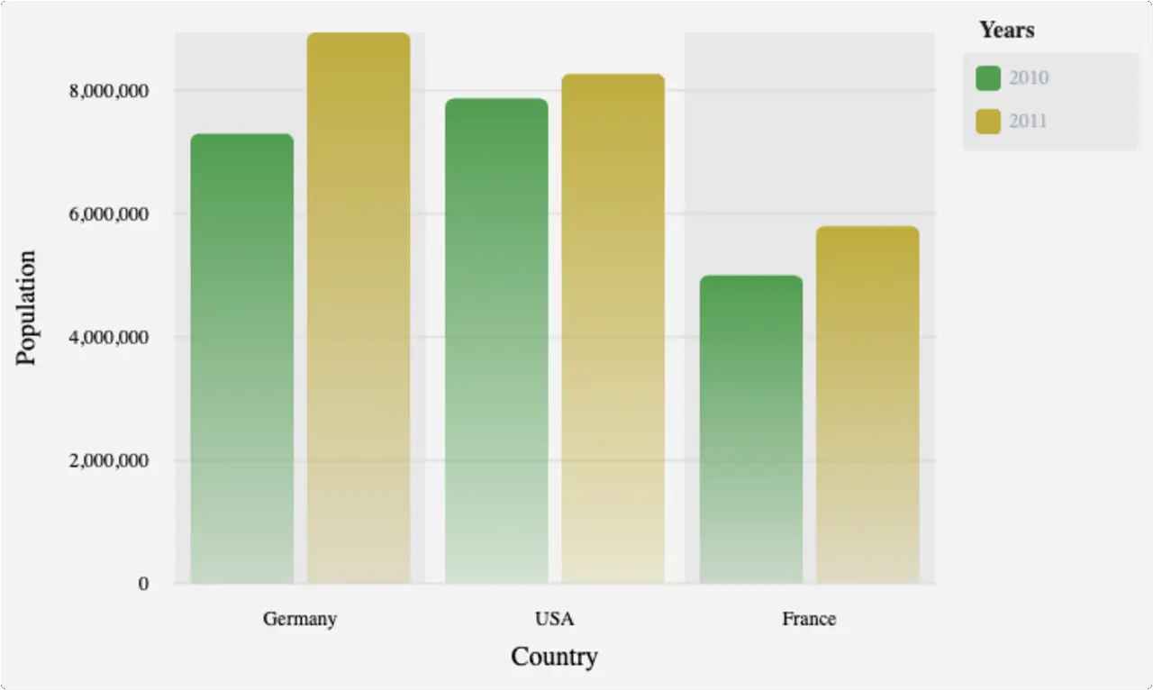
Grouped Vertical Bar Chart Example
- app.module.ts
- app.component.ts
- app.component.html
import { NgModule } from '@angular/core';
import { BrowserModule } from '@angular/platform-browser';
import { FormsModule } from '@angular/forms';
import { BrowserAnimationsModule } from '@angular/platform-browser/animations';
import { NgxChartsModule } from '@swimlane/ngx-charts';

import { AppComponent } from './app.component';

@NgModule({
  imports:      [
    BrowserModule,
    FormsModule,
    NgxChartsModule,
    BrowserAnimationsModule
],
  declarations: [ AppComponent ],
  bootstrap:    [ AppComponent ]
})
export class AppModule { }
import { Component, NgModule } from '@angular/core';
import { BrowserModule } from '@angular/platform-browser';
import { NgxChartsModule } from '@swimlane/ngx-charts';
import { multi } from './data';

@Component({
  selector: 'my-app',
  templateUrl: './app.component.html',
  styleUrls: ['./app.component.css']
})
export class AppComponent {
  multi: any[];
  view: any[] = [700, 400];

  // options
  showXAxis: boolean = true;
  showYAxis: boolean = true;
  gradient: boolean = true;
  showLegend: boolean = true;
  showXAxisLabel: boolean = true;
  xAxisLabel: string = 'Country';
  showYAxisLabel: boolean = true;
  yAxisLabel: string = 'Population';
  legendTitle: string = 'Years';

  colorScheme = {
    domain: ['#5AA454', '#C7B42C', '#AAAAAA']
  };

  constructor() {
    Object.assign(this, { multi })
  }

 onSelect(data): void {
    console.log('Item clicked', JSON.parse(JSON.stringify(data)));
  }

  onActivate(data): void {
    console.log('Activate', JSON.parse(JSON.stringify(data)));
  }

  onDeactivate(data): void {
    console.log('Deactivate', JSON.parse(JSON.stringify(data)));
  }
}
<ngx-charts-bar-vertical-2d
  [view]="view"
  [scheme]="colorScheme"
  [results]="multi"
  [gradient]="gradient"
  [xAxis]="showXAxis"
  [yAxis]="showYAxis"
  [legend]="showLegend"
  [showXAxisLabel]="showXAxisLabel"
  [showYAxisLabel]="showYAxisLabel"
  [xAxisLabel]="xAxisLabel"
  [yAxisLabel]="yAxisLabel"
  [legendTitle]="legendTitle"
  (select)="onSelect($event)"
  (activate)="onActivate($event)"
  (deactivate)="onDeactivate($event)">
</ngx-charts-bar-vertical-2d>
Input
| Property | Type | Default Value | Description |
|---|---|---|---|
| view | number[] | | the dimensions of the chart [width, height]. If left undefined, the chart will fit to the parent container size |
| results | object[] | | the chart data |
| scheme | object | | the color scheme of the chart |
| schemeType | string | ‘ordinal’ | the color scale type. Can be either ‘ordinal’ or ’linear’ |
| customColors | function or object | | custom colors for the chart. Used to override a color for a specific value |
| animations | boolean | true | enable animations |
| legend | boolean | false | show or hide the legend |
| legendTitle | string | ‘Legend’ | the legend title |
| legendPosition | string | ‘right’ | the legend position [‘right’, ‘below’] |
| xAxis | boolean | false | show or hide the x axis |
| yAxis | boolean | false | show or hide the y axis |
| showGridLines | boolean | true | show or hide the grid lines |
| roundDomains | boolean | false | round domains for aligned gridlines |
| showXAxisLabel | boolean | false | show or hide the x axis label |
| showYAxisLabel | boolean | false | show or hide the y axis label |
| xAxisLabel | string | | the x axis label text |
| yAxisLabel | string | | the y axis label text |
| trimXAxisTicks | boolean | true | trim or not ticks on the x axis |
| trimYAxisTicks | boolean | true | trim or not ticks on the Y axis |
| maxXAxisTickLength | number | 16 | max length of the ticks. If trimXAxisTicks is true, ticks over this length will be trimmed |
| maxYAxisTickLength | number | 16 | max length of the ticks. If trimYAxisTicks is true, ticks over this length will be trimmed |
| xAxisTickFormatting | function | | the x axis tick formatting |
| yAxisTickFormatting | function | | the y axis tick formatting |
| xAxisTicks | any[] | | predefined list of x axis tick values |
| yAxisTicks | any[] | | predefined list of y axis tick values |
| showDataLabel | boolean | false | displays the value number next to the bar |
| noBarWhenZero | boolean | true | hide bar if value is 0 and setting is true |
| gradient | boolean | false | fill elements with a gradient instead of a solid color |
| activeEntries | object[] | [] | elements to highlight |
| barPadding | number | 8 | padding between bars in px |
| groupPadding | number | 16 | padding between groups in px |
| tooltipDisabled | boolean | false | show or hide the tooltip |
| tooltipTemplate | TemplateRef | | a custom ng-template to be displayed inside the tooltip |
| yScaleMax | number | | the maximum value of the y axis (ignored if chart data contains a higher value) |
| wrapTicks | boolean | false | axis tick labels will wrap based on available space |
Outputs
| Property | Description |
|---|---|
| select | click event |
| activate | element activation event (mouse enter) |
| deactivate | element deactivation event (mouse leave) |
Data Format
[
  {
    "name": "Germany",
    "series": [
      {
        "name": "2010",
        "value": 7300000
      },
      {
        "name": "2011",
        "value": 8940000
      }
    ]
  },

  {
    "name": "USA",
    "series": [
      {
        "name": "2010",
        "value": 7870000
      },
      {
        "name": "2011",
        "value": 8270000
      }
    ]
  }
]
Related Posts


A Guide to the useReducer Hook in React
Certainly! The useReducer hook is another important React Hook that is used for managing complex state logic in functional components. While the useState hook is great for managing simple state, useReducer is a more suitable choice when you have more advanced state management needs, such as when state transitions become intricate or when you need to manage multiple related pieces of state.
